- The theme zip file Fennik.zip
- Child theme for easier customize in Fennik-child.zip
- Document in Documentation
Struct look like:

Thank you for purchasing our theme. If you have any questions that are beyond the scope of this documentation, please feel free create topic on my help desk. Thanks so much!
First of all, to install our theme and run it you need the content management system which is called WordPress.
Front End Builder & Options: Very powerful features of our theme are front-end page builders, theme options are built on the live customizer of WordPress and the elements are built with the most powerful front-end page builder Elementor.
Customizer: With the very powerful innovative WordPress Live Customizer you will be able to preview the changes made to your WordPress website in real time before pushing them live. Lots of options will make it a breeze for you to modify the structure and the visuals of your theme, including color scheme, typography, portfolio, blog, shop layout, and much more.
Elementor: Elementor is the ultimate WordPress page builder, the key difference is that you can reach a high level of design while designing live and on the front end of your site. Elementor is a page builder plugin that replaces the basic WordPress editor with a live frontend editor, so you can create complex layouts visually, and design your website live, without having to switch between the editor and the preview mode. The page builder enables you to reach a top-notch quality of design without needing to use code or CSS and doesn't require code knowledge.
Inherit Option: Most of the options in the elements have the option to inherit the values from the theme options. With this option, you can create multiple pages or have multiple elements with the same settings inherited from the theme options. No worries, inherit is not the only option from the select, the inherit option usually stands at the top which is followed by the normal options.
Support: To have someone cover your back 24/7 is really something when it comes to the questions that are related to the product. The satisfaction of the client is what motivates us to work more and more. Currently, our author rating from our clients stands at 4.98 from 5 with more than 240 reviews with 5 stars. Start by creating a ticket at our support system at https://support.la-studioweb.com/
To use Fennik, you must be running WordPress 4.4 or higher, PHP5.6 or higher, and MySQL 5 or higher. We have tested it with Mac, Windows and Linux. Below is a list of items you should ensure your host can comply with.
Many issues that you may run into such as: white screen, demo content fails when importing, empty page content and other similar issues are all related to low PHP configuration limits. The solution is to increase the PHP limits. You can do this on your own, or contact your web host and ask them to increase those limits to a minimum as follows:
If you don’t have access to the php.ini file, you can add the following values in your .htaccess file:
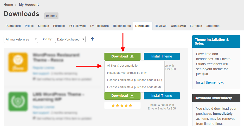
Get the Fennik Theme installation package from your account(after login on Themeforest.net) at downloads page and save it to your computer.
Step 1 - Login to your Wordpress Dashboard
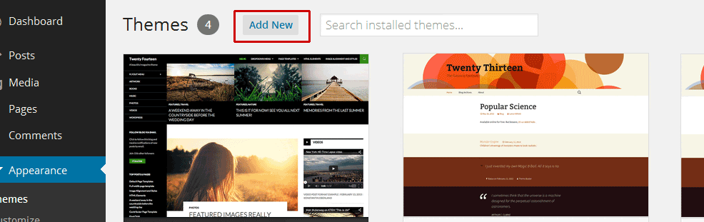
Step 2 - Go to Appearance > Themes. Click the Add New button or Add new theme link. (check screenshot below)
Step 3 - Click on the Upload Theme button. Locate "Fennik.zip" and click Install Now.
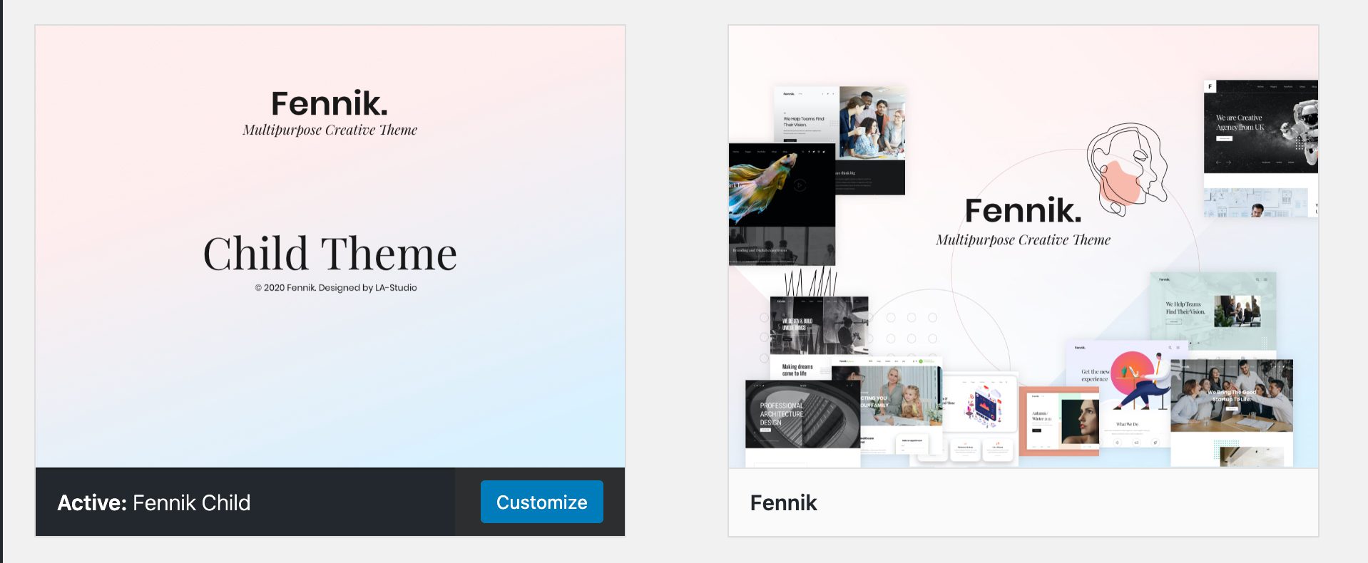
Step 4 - Click on the Activate button to activate Fennik. Congratulations, you have now activated Fennik! You can now proceed with Fennik's Plugin Installation.


Step 1 - Log into your Hosting server using an FTP client (like FileZilla or WinSCP).
Step 2 - Locate "Fennik.zip" that you found in your ThemeForest Package and unzip it somewhere on your hard drive. Once it is unzipped it will look like a folder named Fennik with all theme files in it.
Step 3 - Locate your Wordpress installation and upload the theme directory Fennik (you unzipped in the previous step) into ../wp-content/themes/ in your Wordpress installation.
Step 4 - Click on the Activate button to activate Fennik. Congratulations, you have now activated Fennik! You can now proceed with Fennik's Plugin Installation.
All plugins required have been zipped/already into your download package, so you only need to do is click on the "Begin installing plugins".
You should be navigated to the Install Required Plugin page, which shows a plugin list similar to this(list plugins on images below only an example, not for Fennik):
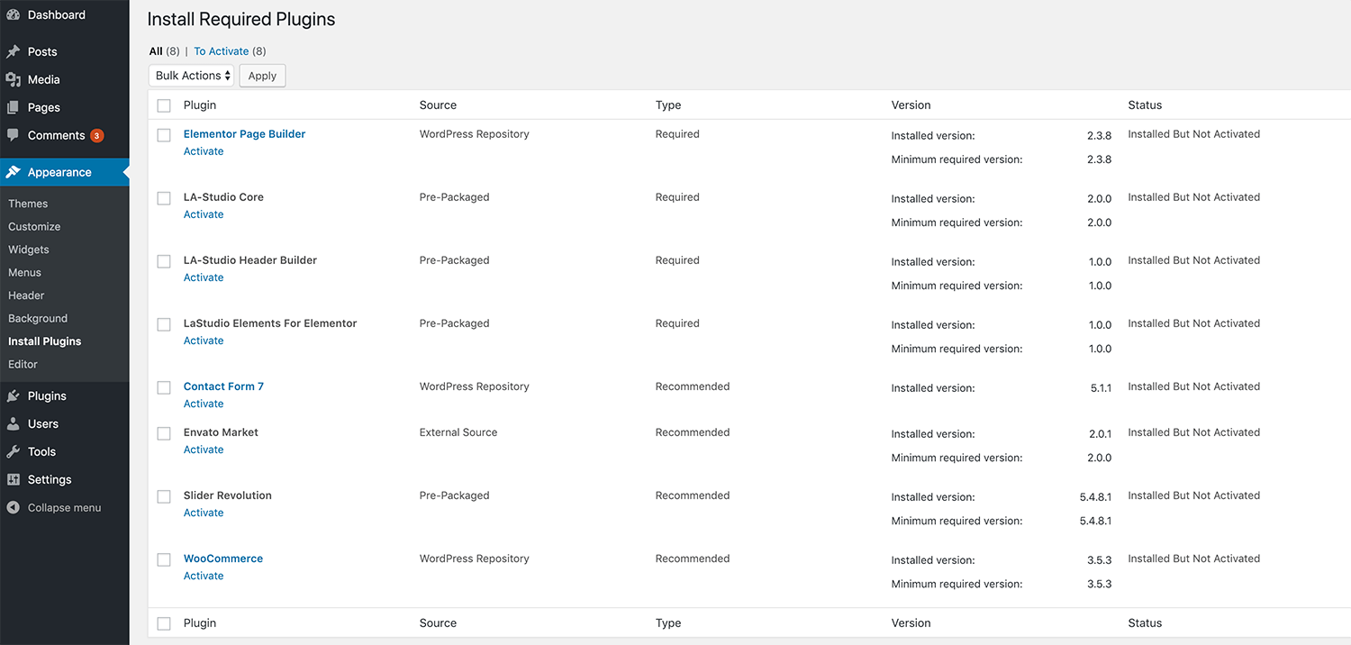
Next, Click on the checkbox beside "Plugin" label to select all plugins in the list.

Then choose "Install" from the drop-down list at the top and then click "Apply".

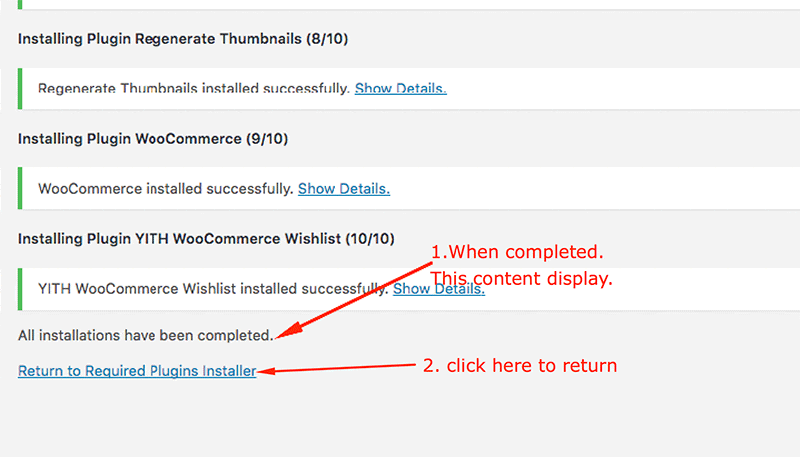
The installing process status will be shown in your browser. It may takes a few minutes, so please be patient. After sucessfull, your screen like that

When the notice "All installations have been completed" appears, click on the "Return to Required Plugins Installer" link to turn back to the plugin list.
Next, click on the box beside the Plugin label again to select all plugins and choose Activate this time as image below.

There are a couple of different ways to update our WordPress themes to the latest version:
Once installed, activated, and setup, the Envato Market plugin will display a notice in your WordPress dashboard when an update is available. To setup:


With Fennik, you can build a functioning website just by clicking a button and install our demo data or click 4.2.1 Create A New Page to step by step. Your Fennik installation will be set up with what we have on our demo website, and you can use it as a template to develop your own website.
Go to Tools > Demo Importer

Then select the demo which you want import and click to button "Import Demo"

The progressing would be displayed on import status bars so you will know when it is finished and your data is ready.

This process will take about some minutes

DONE. Now, you can visit your website to view demo.
You can create any number of pages with content. Our theme includes several page templates to choose from, and you will need to choose the page template that suits your needs. All of this is done in the pages section of your WordPress admin.
If you DID NOT One Click Install Demo Data, you will need to MANUALLY CREATE your Home and other pages. Here’s how to build it:
Step 1 – Navigate to Pages in your admin sidebar and click Add New option.
Step 2 – Input a new name for your page.
Step 3 – Set your Parent page. It’s usually set to No Parent.
Step 4 – Set your page template from the Template dropdown list.
Step 5 – Content for your page goes in the editing field, use the Visual or Text editor.
Next, you can publish this page and set it as your frontpage(5.2.9. Settings a static page as Home) in the Wordpress Settings panel.
If you are new to WordPress and have problems with setting up the theme you might want to import the demo content file that comes with the theme. The following actions will import some dummy posts and pages from the live preview:

Select WordPress from the list

Continue with steps in image


Display asked to import author, selected and continue

After completing all above steps, you must re-check somethings compare wih my demo, because have some settings/data maybe not include.
If you don't want to use the demo content pack, you can read the instructions on how to work with our theme built-in page to make your own pages.
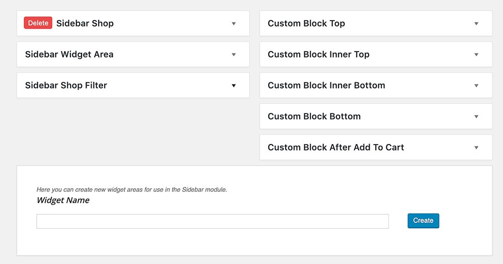
In this section will provide a list of pre-defined sidebars as well as a map of their locations on a page, so that you will find it easier when pulling out widgets to set up your site.

To add new widget areas : Please go to Appearance -> Widgets
You can do step by step as image below to build contact form

You can visit Contact Form 7 Plugin to further details.
Or copy and paste content below to Form field(see image above)
You can adjust WordPress settings as follow:
Step 1 – You can set Site Title, Tagline in Settings > General
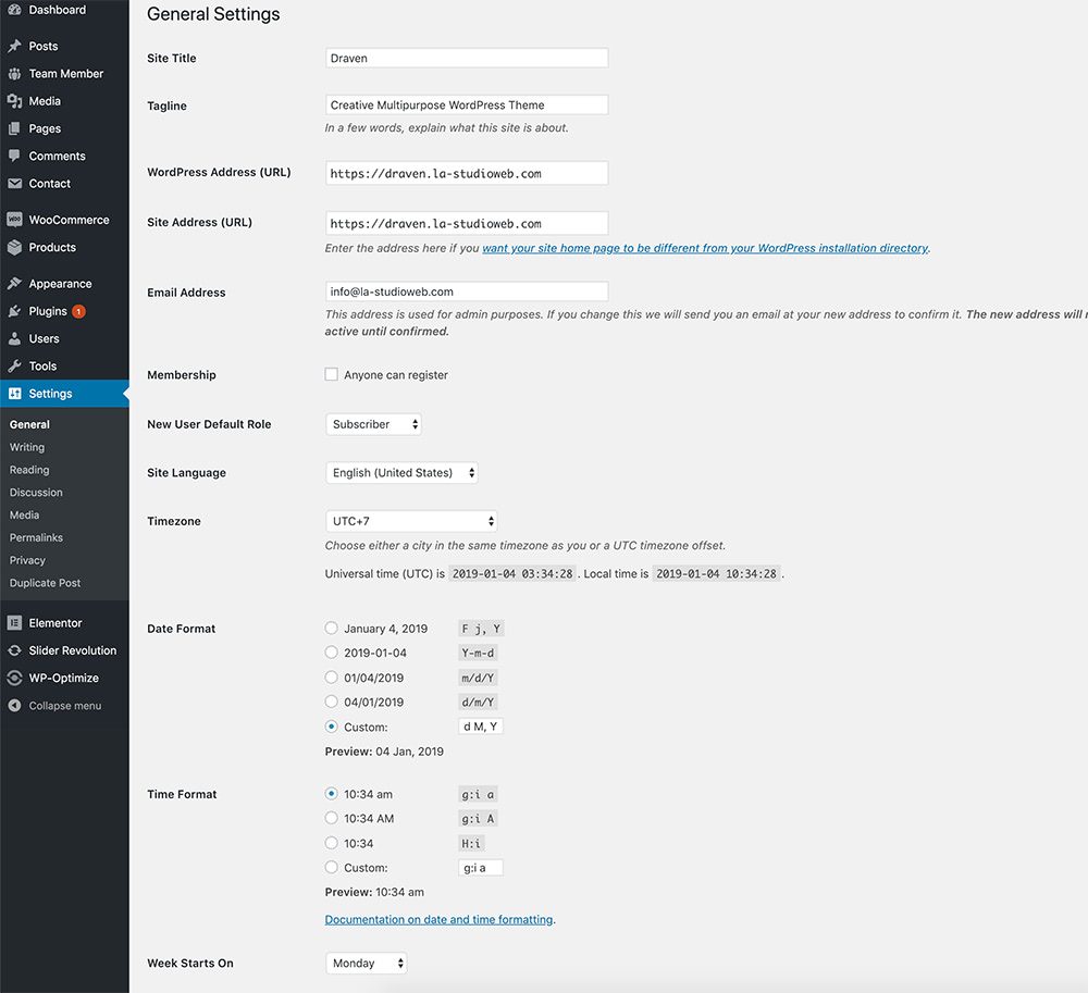
Step 2 – You can set Blog pages show at most in Settings > Reading
Step 3 – You can select Front Page displays in Settings > Reading

Step 4 – You can set Discussion settings in Settings > Discussion

Step 5 – You can change Image sizes in Settings > Media
To add more image sizes - you can use 3rd plugin https://wordpress.org/plugins/simple-image-sizes/
We used the following sizes on our demo sites:
Thumbnail size: 370 x 250
Medium size: 570 x 380
Large size: 770 x 390
Step 6 – You should ensure that a non-default permalink setting is selected, e.g. Month and name in Settings > Permalinks

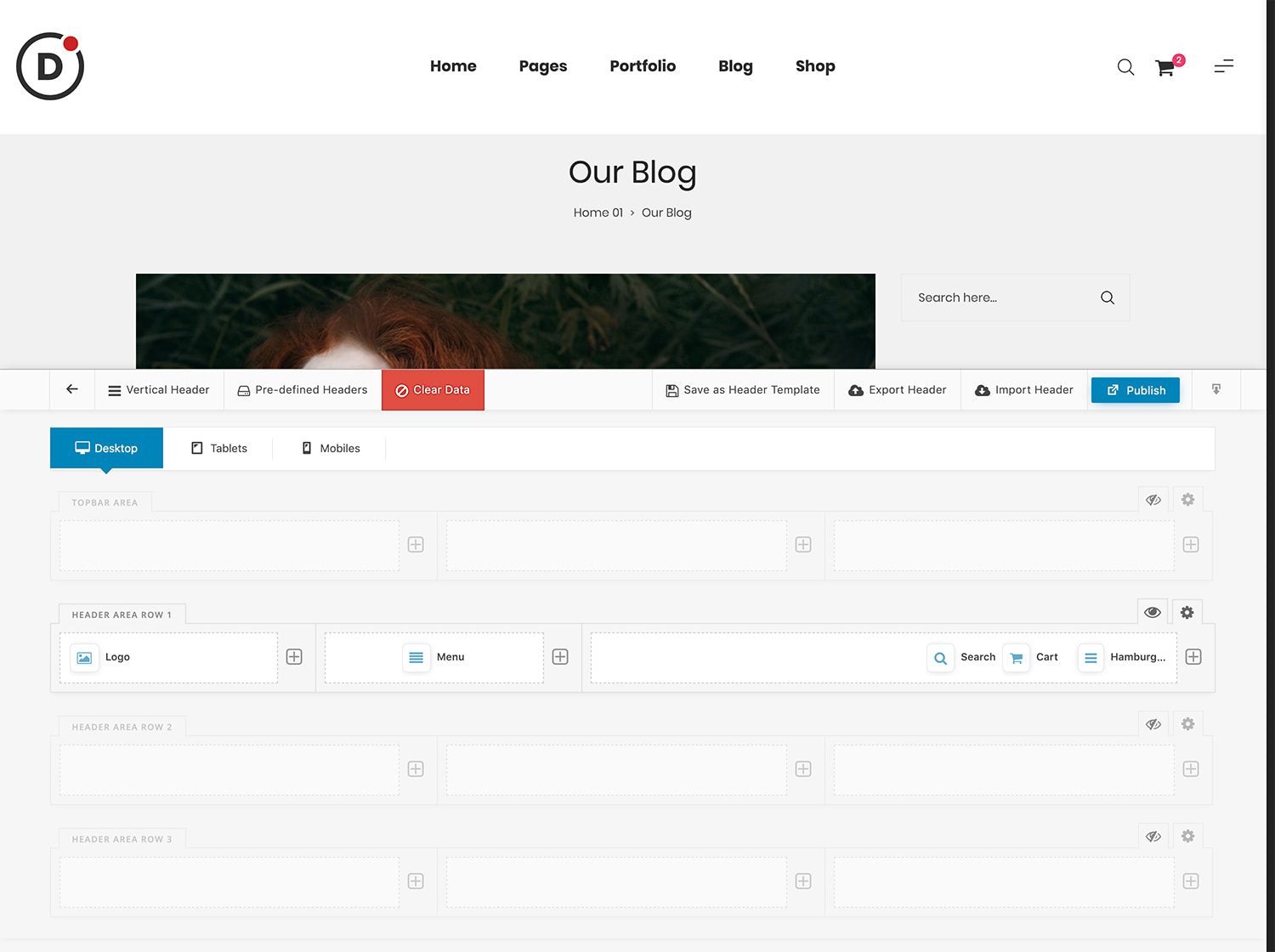
Header Builder is a drag-and-drop editor to help you build and customize your own headers.
To user this feature - please go to Appearance -> Header Builder
To better understand how it works you can see more video tutorials https://www.youtube.com/channel/UCESTyTYhnWI_HlIjFnQY5cQ
Elements Avaiables

Admin Mode
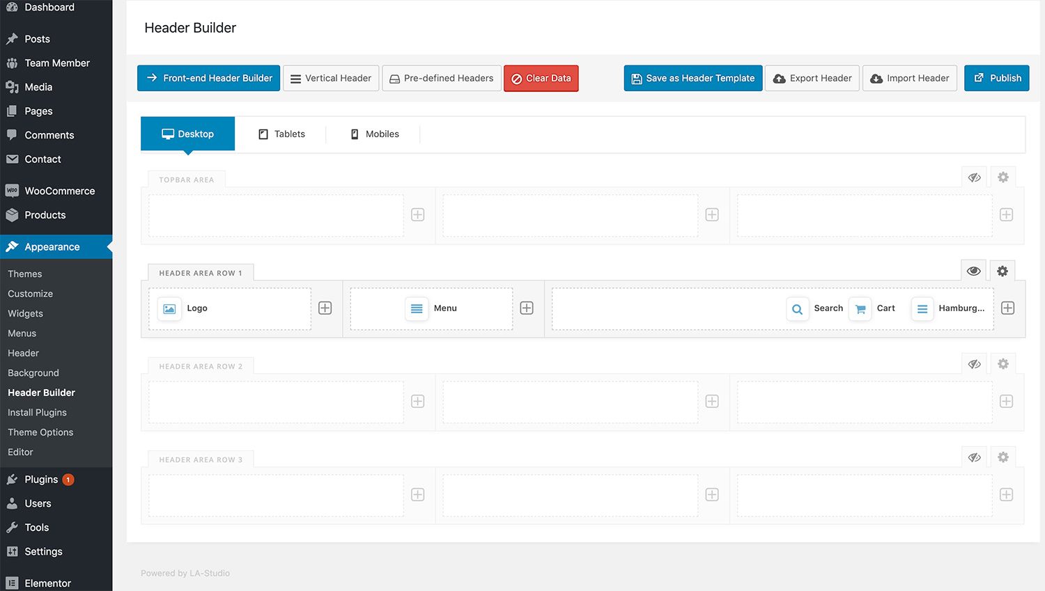
Front-End Mode
To better understand how it works you can see more video tutorials https://www.youtube.com/channel/UCESTyTYhnWI_HlIjFnQY5cQ
Manager Footer Template Please go to Elementor -> My Templates -> Footer

Editing Footer

Change Footer Layout Please go to Appearance -> Theme Options -> Footer and then you will see the option


"Global Layout" tab is divided into a few sections. Asides from the Install Demo Data section mentioned above, there are a few important sections for you to customize your layout.

| Attribute | Description |
|---|---|
| Layout | Select main content and sidebar alignment. Choose between 1, 2 or 3 column layout. |
| Enable Main FullWidth | layout website full screen |
| Enable Google Rich Snippets | Show Google Rich Snippets In the Breadcrumbs |
| Show Button "Back To Top" | Turn on this option if you want to enable "back to top" button on your site |
| Enable Page Loader Icon | Turn on Overlay & Icon loader when visit page |
In this section you can control global header settings of your site

In this section you can control all footer settings of your site


| Attribute | Description |
|---|---|
| Layout | Select main content and sidebar alignment. Choose between 1, 2 or 3 column layout. |
| Blog Type | Post item will be display (Ex: Grid, List ..) |
| Post columns | Number post will be displaying in per row |
| Enable Masonry Mode | If value is "ON" the masonry mode is enable |
| Excerpt Length | Type Number ( Number characters of excerpt will be displayed |
| Post Image Size | Enter image size (Example: "thumbnail", "medium", "large", "full" or other sizes defined by theme). Alternatively enter size in pixels (Example: 200x100 (Width x Height)). |
| Show Continue Reading | If value is "ON" the link "Continue reading" will be display |
| Enable Pagination ajax loader | |
| Enable Infinite Scroll |
In this section you can control all single blog settings of your site

| Attribute | Description |
|---|---|
| Custom Page Layout | Select main content and sidebar alignment. Choose between 1, 2 or 3 column layout. |
| Show Breadcrumbs | Turn Off this option if you want to hide breadcrumbs info area on single blog |
| Show Posts Navigation | Turn Off this option if you want to hide navigation on single blog |
| Show Author Info | Turn Off this option if you want to hide author info area on single blog |
| Show social share link | Turn Off this option if you want to hide social share link area on single blog |
| Show comment | Turn Off this option if you want to hide comment form area on single blog |
| Related Post | Turn Off this option if you want to hide related post area on single blog |
| Related Post By | |
| Related Post Columns | Number columns rel pos display |
In this section you can control all typography settings of your site

| Attribute | Description |
|---|---|
| Body Font | Inlcuded: Font Family(name of font), Font Size, Font Weight. |
| Primary Font | Inlcuded: Font Family(name of font) |
| Secondary Font | Inlcuded: Font Family(name of font) |
In this section you can control all social settings of your site

| Attribute | Description |
|---|---|
| Social Share | Use for share on each post, inlcuded: facebook, twitter, linkedin, google, tumblr, pinterest. |
| Social Profiles | Define link social profiles, inlcuded: Dribbble, Vimeo, Github, Xing, Behance, Deviantart, SoundClound, Yelp, Rss, VK, Email, Instagram, Foursquare, Skype, Flickr, facebook, twitter, linkedin, google, tumblr, pinterest |
In this section you can custom css & javascript of your site

| Attribute | Description |
|---|---|
| Custom CSS | Add some CSS to your theme by adding it to this text-area. Please do not include any style tags. |
| Custom Javascript | Add some Javascript to your theme by adding it to this text-area. Please do not include any style tags. |
In this section you can do all things about menu on your site(create, delete, update)

Megamenu Type "Narrow"


Megamenu Type "Wide"


In this section you can do all things about widgets on your site(create, delete, update). Have 7 widget areas, included: Main Sidebar, Shop Filter Sidebar, Custom Block Top, Custom Block Inner Top, Custom Block Inner Bottom, Custom Block Bottom, Custom Block After Add To Cart
| Name Area | Description |
|---|---|
| Main Sidebar | Add widgets here to appear in your sidebar |
| Shop Filter Sidebar | Appears at the top of the product on shop page |
| Custom Block Top | Appears at the before of main content |
| Custom Block Inner Top | Appears at the top content of main content |
| Custom Block Inner Bottom | Appears at the bottom content of main content |
| Custom Block Bottom | Appears at the after of main content |
| Custom Block After Add To Cart | Appears at the after Add To Cart button |
If you installed the Demo Content, you don’t need to choose a Home Page because my theme do it. In case you creat page manual then following these steps to set a new Page to FrontPage:


Save all your changes!
Elementor is the ultimate WordPress page builder, the key difference is that you can reach a high level of design while designing live and on the front end of your site. Elementor is a page builder plugin that replaces the basic WordPress editor with a live frontend editor, so you can create complex layouts visually, and design your website live, without having to switch between the editor and the preview mode. The page builder enables you to reach a top-notch quality of design without needing to use code or CSS and doesn't require code knowledge.
A very simple element called heading but very powerful, has many use cases and its options make it very powerful and easy to use.
Content Tab:Enter in any string, and watch it type at the speed you've set, backspace what it's typed, and begin a new sentence for however many strings you've set.
Content Tab:{{First Word, Second Word, Third Word}}_.Set counters to a specific end number in a creative way, multiple settings will allow the element to be used attractively.
Content Tab:There are two progress bars, one default which comes from Elementor and the custom one that we have created, both are great for use, we'll explain the one that is located in Neuron Elements.
Functionality:Using the Accordion element lets you save space while still presenting an abundance of content. Add the accordions with a great repeater where you can add the title and the content.
With the Accordion, visitors can scan the item titles, and choose to expand an item only if it is of interest.
When a page is loaded, the first item of the Accordion element is expanded, while all other items remain collapsed. With the Toggle element, however, all items are collapsed when a page is first loaded.
Only one item of an Accordion can be expanded at one time. As you expand another Accordion item, the previously opened item automatically collapses, looking similar to an accordion. With the Toggle element, however, as many items as desired can be expanded at the same time.
Content:The toggle element lets you create text boxes that are collapsed, so the visitor only sees the titles of each text box item. This lets you show your content in a condensed form, so visitors don't have to scroll through a long page and can sift through the titles easily.
A similar element is the Accordion element, but there are two main differences between the Toggle element and the Accordion element.
The Icon List element creates an easy-to-manage list of items, with each item highlighted by its own icon.
Content TabMake sure to install and activate the plugin Contact Form 7, without the plugin you won't be able to create contact forms.
The contact forms are created on the WordPress dashboard menu item called Contact, you can configure them and use them later via the Elementor element shortcode. An example of use.
[contact-form-7 id="5430" title="Classic Style"]
The created form in the contact section:
- https://pastebin.com/raw/EkFF433yIcon boxes come in very handy when building websites. The most common usage is for sections that list features of products or services. It has various options you get to customize every element of this widget: the icon, the headline, and the description. The icons are derived from the Font Awesome Icons, and you are able to search through them and pick the right one.
Content TabThe Image Box element lets you add an image box that combines an image with a headline and text, which is often used in features sections, as an alternative to using the Icon Box element.
ContentThe Divider element allows you to add style, horizontal lines that divide your content. This is a basic element, but it can help you create nice effects as separators of various sections, or for highlighting your headings.
Shape dividers are graphic shapes that separate the sections of a page.
How to Add Shape Dividers


Install plugin http://wordpress.org/extend/plugins/regenerate-thumbnails/

1. Go to: Products > Attributes.
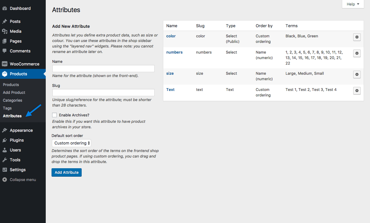
2. Create a new attribute, or skip this step if you already have one.
3. Select the gear icon on the right next to the attribute. When you hover over this icon, you’ll see “Configure terms”.

4. Add New Color or whatever your attribute is called (or choose to edit an existing term).
5. Select either “Color” or “Image” in the Swatch Type dropdown.


8. Select Add New Color.
For more information about setting up and managing Global Product Attributes, see: Managing Attributes.
Color and photo swatches can only be used for variable products.
1. Create a variable product. Make sure that you select a global attribute or create a custom one in the “Attributes” tab. Also set up the “Variations” tab. More information about that can be found here:
2. Publish your product.
3. Go to the Swatches tab.
4. Select a “Type” for each of the attributes used for the variations.
5. Choose whether to add a label or not and where to add it, if you’ve selected “Taxonomy Colors and Images” or “Custom Colors and Images”. This label will display the name of the selected term.

6. Select the size of the swatches if you’ve selected “Custom Colors and Images”. This will determine how large the swatches will be on the product page.

7. Configure the attribute terms. This is similar to how global attribute terms are configured (see above).

8. Update the product.


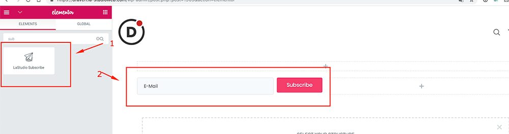
Please go to Appearance> -> Theme Options -> Extensions -> Mailing List Manager

And then you can see the widget on the elements
If you have any questions that are beyond the scope of this documentation
Please feel free to us via HelpDesk https://support.la-studioweb.com/.
Thanks so much!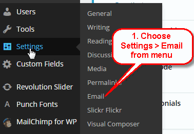

Social Link
In this section you can control all social settings of your site